


Nature colors are more than beautiful—they are instinctively balanced, emotionally resonant, and deeply rooted in our connection to the natural world. From forest greens to ocean blues and desert ochres, natural color palettes provide an endless source of inspiration for design, wellness, and creativity. In this guide, we’ll explore the science, psychology, categories, and practical uses of nature’s most timeless hues.
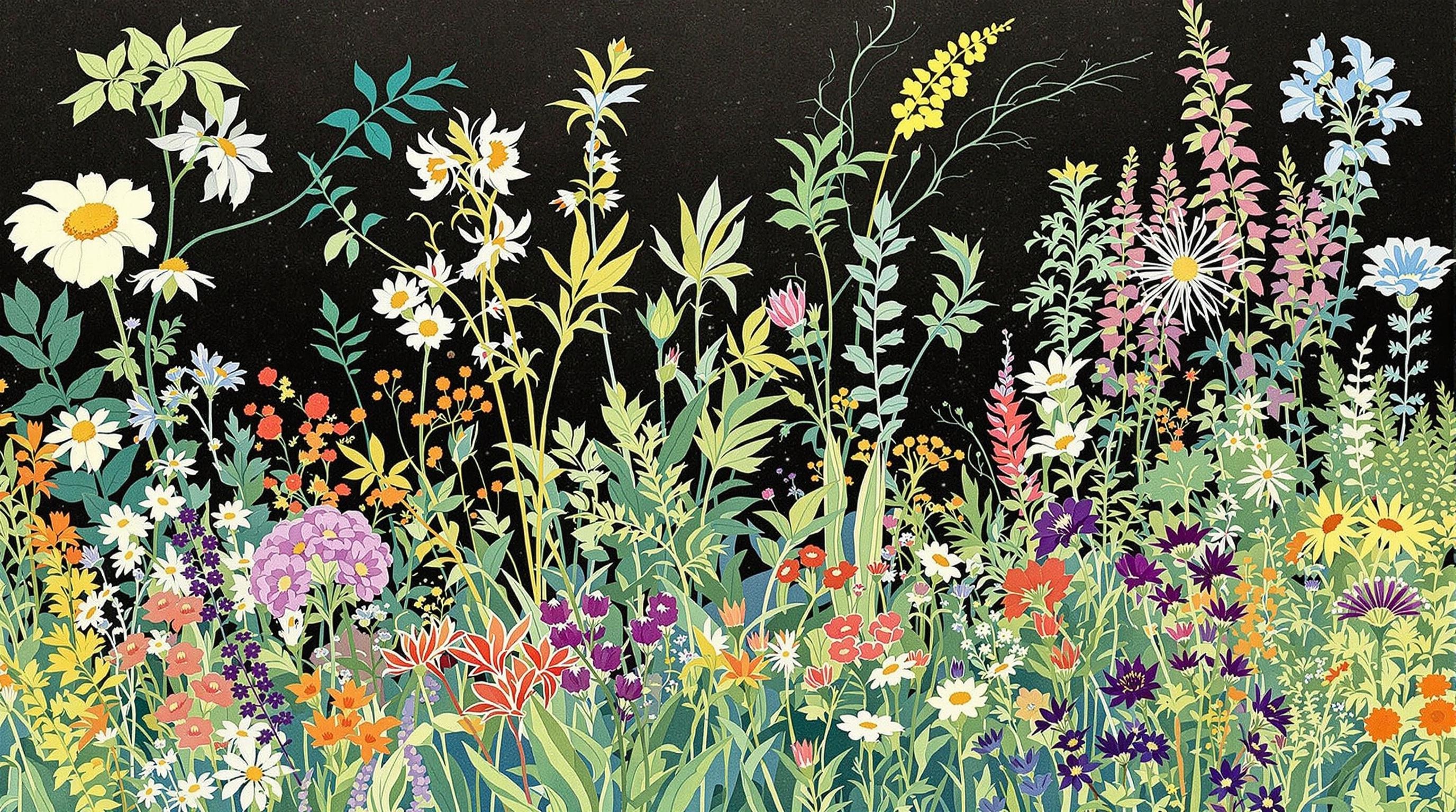
Natural color palettes are collections of hues drawn directly from the environment—think forests, oceans, deserts, mountains, and seasonal shifts. These palettes are rooted in the visual language of nature, reflecting the organic harmony found in landscapes, flora, fauna, and weather patterns. Unlike synthetic or artificial colors, natural tones tend to be more subdued, complex, and emotionally resonant.
Examples of natural colors include the deep greens of pine needles, the muted blues of the sky at twilight, the warm ochres of desert sand, and the soft grays of river stones. These palettes often include a mix of warm and cool tones, creating a balance that feels both calming and dynamic.
Natural colors often evoke a deep, instinctive connection in people. This is largely due to the way humans have evolved alongside nature. We are biologically attuned to the colors in our environment, which once served as indicators of safety, food, weather, and terrain. As a result, natural hues tend to feel familiar and soothing.
For example, greens—commonly seen in forests and plant life—are often associated with growth, tranquility, and stability. Earth tones such as browns and terracotta evoke warmth and groundedness, while blues from water and sky suggest calmness and clarity. These associations are not only psychological but also cultural, appearing in art, fashion, and architecture throughout history.
Nature’s color combinations are rarely random. They are the result of light, geography, climate, and biological adaptation. This means that the color relationships found in nature often follow principles of color theory—such as complementary, analogous, and triadic schemes—without intentional human design.
For example:
These visual patterns create a sense of cohesion and harmony that designers can emulate. When used in design, nature-inspired palettes help foster emotional responses such as relaxation, inspiration, or invigoration, depending on the chosen tones.
Color Hunt, a popular digital color palette resource, plays a key role in making nature-inspired palettes accessible to designers. Through carefully curated collections, Color Hunt showcases palettes that reflect the elegance and complexity of natural hues. These palettes are often inspired by real-world photography, landscapes, and environmental themes, allowing users to explore a wide range of nature-based color schemes for various design applications.
By offering palettes categorized by mood, tone, and theme, Color Hunt helps bridge the gap between the organic beauty of nature and the structured world of digital and visual design.
Nature offers a vast and diverse spectrum of colors that serve as the foundation for countless design schemes. These core natural color categories are derived directly from the elements of the natural world — forests, oceans, deserts, skies, and more. Each category reflects a unique emotional tone, cultural symbolism, and aesthetic value that can be adapted for various design applications.
Green is one of the most dominant colors in nature, symbolizing growth, renewal, and tranquility. From the soft tones of moss and sage to the vibrant hues of grass and ferns, green evokes a sense of calm and balance. These shades are commonly found in forest and woodland palettes and are often used in design to promote relaxation and harmony.
Common green hues in natural palettes:
Inspired by the sky and sea, blue is associated with depth, openness, and peace. Coastal and ocean-themed palettes frequently draw from the rich blues of the ocean, the muted grays of rainy skies, and the powdery tones of morning mist. Blue tones can create a cool, calming effect in any design, especially when paired with sandy neutrals or natural whites.
Popular natural blues include:
Earth tones are grounded in the colors of soil, stone, and wood. Ranging from warm sandy beiges to deep chocolate browns, these hues convey warmth, stability, and a connection to the earth. They are foundational in desert palettes, woodland themes, and rustic aesthetics.
Key earth tones:
Neutral colors like beige, ivory, taupe, and greige are abundant in nature and serve as the base for many natural color palettes. These tones are versatile and timeless, providing a soft backdrop that allows accent colors to stand out. They are often inspired by natural materials such as stone, linen, driftwood, and bark.
Common neutral tones:
Nature’s warm colors are often found in flowers, sunsets, and autumn leaves. These include rich reds, burnt oranges, and golden yellows that bring energy and emotional warmth to a palette. Though used sparingly, these colors can serve as powerful accents and focal points in a design.
Examples of natural warm tones:
Cool natural tones are drawn from shaded forests, icy landscapes, and deep bodies of water. These include subdued purples, cool blues, and muted greens. They help create a reflective, soothing atmosphere, making them ideal for restful spaces or minimalist designs.
Examples include:
Natural color categories also shift with the seasons. Spring introduces fresh greens and floral pastels, while summer brings saturated blues and citrus brights. Autumn is dominated by warm reds and earthy browns, and winter features cool grays, whites, and evergreen tones. These seasonal palettes allow designers to reflect the changing rhythms of the natural world in their work.
Seasonal palette highlights:
Each of these core natural color categories reflects a unique aspect of the environment and serves as a rich source of inspiration for creating harmonious, emotionally resonant designs. Whether used individually or in combination, they help bridge the gap between the built environment and the natural world.
Natural color harmonies are central to creating aesthetically pleasing and emotionally resonant designs. By drawing inspiration directly from nature, designers can tap into a palette that feels instinctively balanced and universally appealing. Nature’s color combinations are not random—they follow principles of harmony, contrast, and rhythm that have been refined by evolution and seasons over millennia. Understanding and applying these principles can guide designers in achieving visually cohesive and emotionally compelling results.
Nature provides countless examples of harmonious color relationships. Whether it's a misty mountain range at dawn or a blooming garden in spring, the colors in these natural settings are arranged in ways that evoke calm, energy, warmth, or coolness without feeling forced or artificial.
For example:
Color theory provides a framework for understanding why certain combinations from nature are so effective. Here’s how key concepts apply:
Analogous schemes use colors that are adjacent on the color wheel—like green, yellow-green, and yellow. These combinations are frequently found in gardens and forests and are ideal for creating serene, unified atmospheres.
Found directly opposite each other on the color wheel—like blue and orange—complementary colors create high contrast and visual interest. Think of a sunset over the ocean, where warm oranges meet cool blues. Using these combinations in design can energize a space or create focal points.
A monochromatic palette uses variations in lightness and saturation of a single hue. Snowy landscapes often use monochromatic schemes of white, gray, and soft blues, creating a minimalist and restful feeling.
Nature also features triadic (three evenly spaced colors on the wheel) and tetradic (four colors forming a rectangle on the wheel) harmonies. For instance, a flower field with violet petals, green stems, and yellow centers naturally aligns with a triadic scheme, offering balance and vibrancy.
The cycle of seasons offers a natural guide to harmonious palettes:
Designers can align their palettes with seasonal moods to tap into emotional resonance and thematic relevance.
Creating a natural color harmony can begin with simply observing and extracting colors from a natural photograph or real-life scene. Tools like digital eyedroppers or color palette generators can help identify key shades, tints, and tones. Online platforms such as Color Hunt provide curated palettes based on natural inspiration, making it easier to apply these principles.
By grounding their choices in the organic harmony found in nature, designers not only achieve visual balance but also forge a deeper emotional connection with their audience.
Natural color palettes draw directly from the hues found in the environment—shades shaped by geological formations, plant life, bodies of water, and seasonal changes. Applying these palettes effectively in design requires not only a visual appreciation for nature but also an understanding of how to translate those colors into functional and harmonious compositions.
When applying a nature-inspired palette, it's important to consider the proportion of each color used. A common guideline is the 60-30-10 rule:
For example, in a forest-inspired interior design, muted greens might dominate (60%), with bark browns as secondary elements (30%), and mossy or fern-like accents (10%) providing contrast and interest.
Nature may offer stunning color combinations, but not all are easily distinguishable for people with color vision deficiencies. When implementing a palette:
Ensuring your nature palette is inclusive allows broader audiences to appreciate and engage with your design.
Before finalizing a palette in a design:
Natural palettes often require subtle refinements, as even a small shift in hue can dramatically alter the feel of a space or interface.
To help apply nature-inspired palettes effectively, several tools and platforms can streamline the process:
These tools help bridge the gap between natural inspiration and digital application, making it easier to translate the beauty of the outdoors into design that feels organic and intentional.
One of the most effective ways to implement nature-inspired color palettes is by using balanced color ratios. A common strategy in design is the 60-30-10 rule: 60% of a dominant color, 30% of a secondary color, and 10% as an accent. Nature often follows similar principles—think of a forest where green foliage dominates, brown tree trunks serve as a secondary tone, and colorful flowers or berries act as accents. Applying these ratios helps capture the natural harmony observed in the wild while maintaining visual interest and cohesion in design.
Inclusivity is crucial when applying nature-based color schemes, especially in digital or public-facing designs. Ensure that chosen colors meet accessibility standards, such as sufficient contrast ratios for text and backgrounds. Tools like the Web Content Accessibility Guidelines (WCAG) provide benchmarks to evaluate color combinations. Nature’s palettes can include low-contrast elements, such as misty grays and soft greens, so designers must adjust saturation and brightness to ensure readability and usability for all users.
Implementing a palette inspired by nature requires iterative testing. Designers should prototype color schemes in context—whether it's a website layout, a living room wall, or packaging design—and assess their effectiveness. This includes user feedback, A/B testing in digital products, or sample boards in interior design. Just like in nature where ecosystems adapt and evolve, color schemes may need refinement to align better with the environment they’re placed in.
Avoid overusing bold or heavily saturated colors that can overpower the natural balance. Nature’s beauty often lies in its subtlety—muted greens, warm browns, and soft blues work best when they’re not competing for attention. Another common pitfall is disregarding the influence of lighting; natural light can dramatically alter the appearance of colors, so test palettes across different lighting conditions.
Also, steering too far from the original inspiration can lead to a loss of authenticity. If a palette is based on a coastal scene, for example, incorporating unrelated hues like neon pinks or industrial grays might undermine the intended organic aesthetic.
To successfully implement natural color palettes, designers can leverage a variety of digital tools:
By combining these tools with observational insights from nature, designers can implement palettes that are both aesthetically pleasing and functionally sound across various design disciplines.
Nature colors reflect the harmony, depth, and emotional power of the environment around us. By understanding their origins, symbolism, and applications, you can use these palettes to create designs that feel grounded, beautiful, and human. Start by observing a natural scene today—or explore curated palette tools—to bring organic color inspiration into your work or life.
📌 Ready to bring nature into your design? Explore Color Hunt’s 'Nature' category or try building your own palette based on today’s sky, landscape, or favorite photo!